The Hyperemesis Gravidarum (HG) Affirmation Postcards packaging needed to protect the product while reinforcing the brand’s emotional tone. The challenge was to design packaging that felt gentle and intentional, without overshadowing the cards themselves.
Task
Develop packaging that complemented the affirmation cards, balanced practicality with brand expression, and supported a cohesive unboxing experience.
A mockup of the outer box for delivery and transit purposes for the HG Affirmation Postcards product set.
The Challenge
Create a packaging design that matches both the card and Mumma Mail visuals, while remaining distinct from other motherhood products.
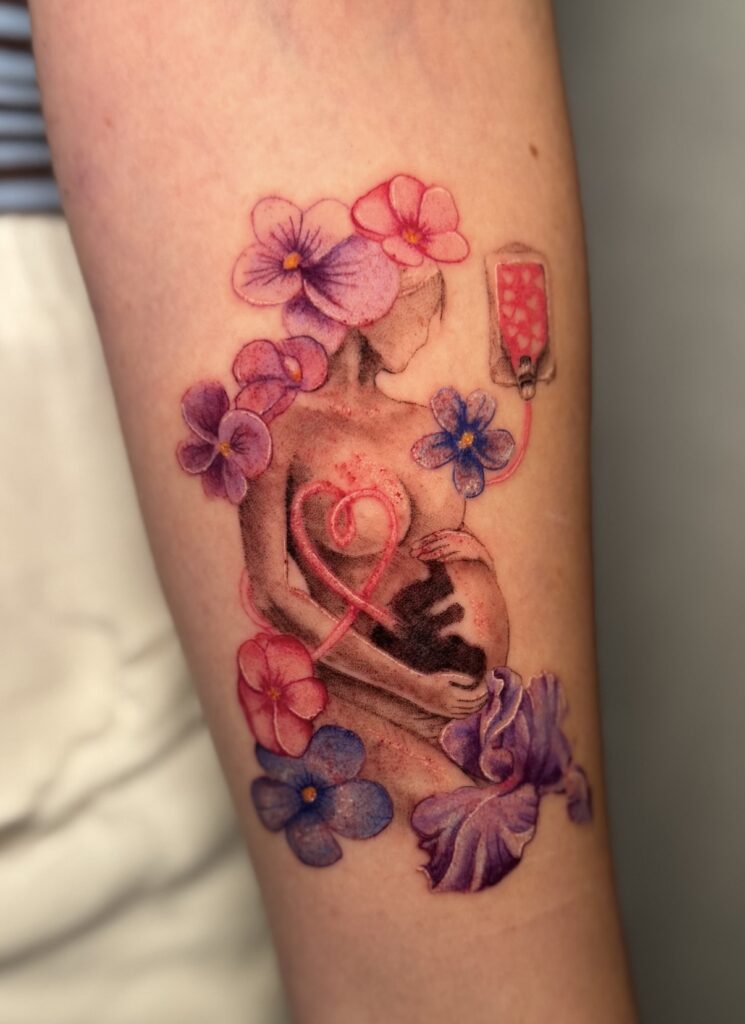
To ensure physical displays of the product would differentiate this card set from other Mumma Mail and other competitors' products, an adapted version of the Hyperemesis Gravidarum (HG) graphic was created to feature flowers whose natural hues matched the HG colours of lilac and sky blue.
This was the initial design for the Affirmation Postcards Inner Packaging Box.
To ensure the product would be easily distinguishable from other Mumma Mail card sets or competitors' products.
An initial sketch of the new layout for the Inner Packaging Box.
A mockup of the outer box for delivery and transit purposes for the HG Affirmation Postcards product set.
"I love the graphic on the box! I'm literally getting it tattooed. The second version is perfect. "